Intro
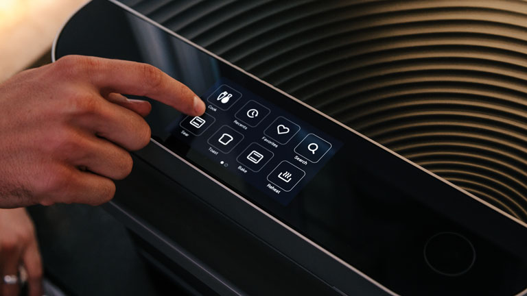

Research, user interviews, user stories, journey-mapping, and low-fidelity mockups.
Wireframes, design systems, graphic design, and style guides.
Animated, interactive, and high-fidelity prototypes.
Development and implementation of user interfaces.
Due to market changes, we could no longer ship meal kits to our customers. Additionally, some late hardware changes resulted in a suboptimal user experience. We needed to address these issues and build ourselves some breathing room for new content and features. Product leadership and customer success team members identified users' most outstanding issues at launch. The VP of Product outlined four things that he wanted to see us ship within a few months of launch:
I was the lead software designer and product owner. I examined a wealth of data from the Brava’s pre-launch period and feedback from the community and our customer success team. We held usability studies in the office to test new concepts against the original designs. We evaluated several factors, including:
We saw a dramatic increase in our net promoter score. We collaborated with many celebrity chefs and gadget reviewers, allowing them to create their own recipes on our platform and share them with the Brava community. Brava was acquired by The Middleby Corporation in 2019.
-Product Review

One significant shift in the product from before launch was the focus on releasing new recipes every week. We also wanted to expand the product's versatility by showing users that we could support a wide variety of ingredients with flexibility in preparation.
Collaborating with culinary, QA, and engineering teams, I created a rough model of how this new format could work. I then iterated on wireframes, mockups, and prototypes using actual data from the product CMS. Time and attention were paid to the depth of our initial offering, showing users a wide assortment of vegetables and proteins. The system would include modular objects known as “cookables,” which can be used by the software to assemble full recipe programs with complete instructions and photos.
The initial release added more than 7,000 new recipe programs. This feature also led to additional updates simplifying the core recipe format while leveraging procedurally- and user-generated content.
Early smartphones came in various screen sizes, making broad distribution difficult. In particular, at Kiwi, we often had small teams working to resize assets and animations to fit a range of devices. Further complicating matters were development pipelines–when can designers and artists successfully hand off their work to engineers? Assets required extensive technical prep work to ensure compatibility with the code. Artists would spend hours painstakingly detailing animation properties without guarantees their expectations would translate into the game engine. Human error was also prevalent, given the time investment involved. There was a need to improve this process.
I researched every requisite task in the development paths for game sprites, effects animations, and UI layout. I started with the quickest fixes yielding the most significant impact. I learned about Photoshop tools development and scripted a few different automation utilities. Next, I researched our engine’s UI system and determined how we could be more efficient there, too, as designers followed the same treacherous handoff with engineers for their work. I reverse-engineered the games’ UI format and then scripted a utility that converted Photoshop files into this format. The utility evaluated layers individually and extrapolated properties to XML during export.
Artists no longer spent hours manually scaling and renaming files to game- and platform-specific specifications. Engineers now had a consistent and reliable pool of instantly repurposable game assets. The company could launch more, higher-quality games faster. More importantly, our development team, as a whole, could focus on higher-priority tasks.
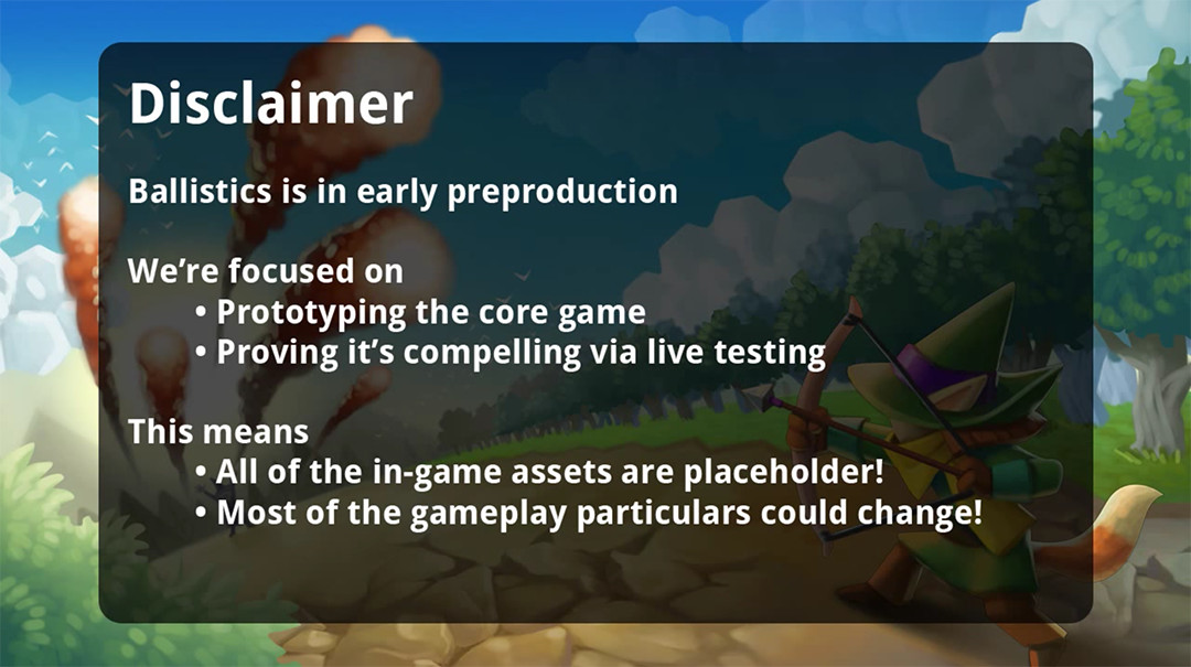
The game had a hastened development cycle of only a few months. For many of us on the team, this was our first time using Unity professionally. Being a mobile game, Ballistics was very UI-dependent, which Unity struggled with in earlier versions. Fortunately, we built from the 4.6 version of the engine, which included a beta version of the current Unity UI tools.
We assembled a working multiplayer prototype in less than a month, which then allowed us to hold nightly playtest sessions with the rest of the company. We would interview participants at the end of each session to get feedback on gameplay, controls, visuals, level design, etc. The following morning, the team would discuss the playtest feedback and how to incorporate some of the most common remarks. This process continued day after day for a few weeks, eventually culminating in a public release on Android. We continued playtesting sessions and used the game's built-in chat to interview players directly!
Because we were primarily working with scratch assets, we could make many pivotal game balance and interface changes before devoting too much time to visuals. An initial focus on gameplay also allowed the artists to spend more time in the concept phase of their work.
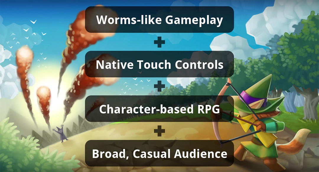
This project was a great introduction to Unity and led to our eventual acquisition by a larger studio. It was also a quality exercise in building a game from start to finish in a few months.
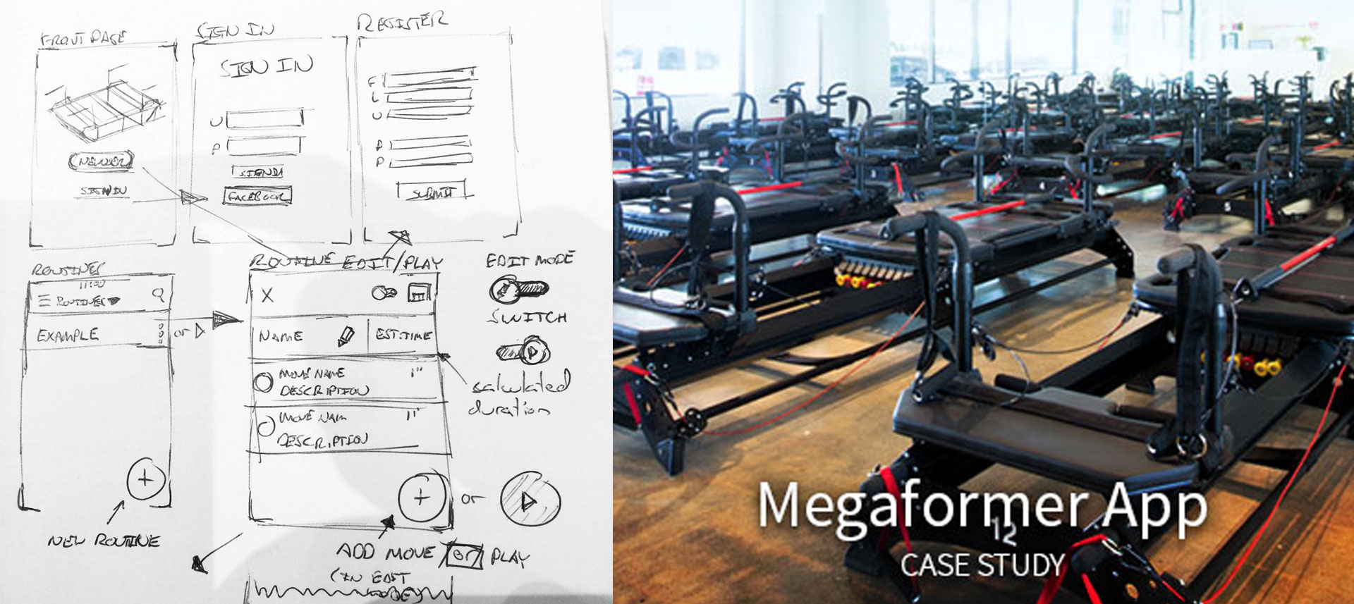
Unfortunately, the official site, while filled with information, was a mess. Other instructors I had spoken with indicated that whatever methods they used to create and organize their routines were also disorganized: files on flash drives, numerous Google docs with confusing names, etc.
Other fitness programs, such as Schwinn Indoor Cycling, have had handy teacher resources, and I wondered how Lagree could benefit from something similar.
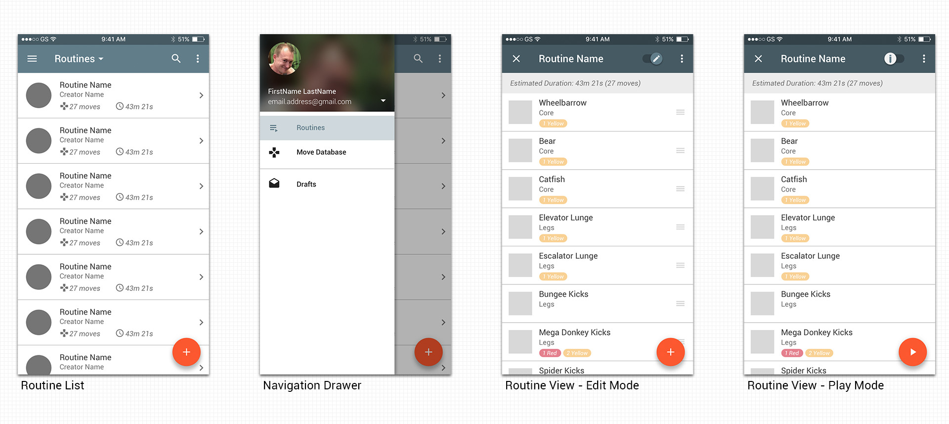
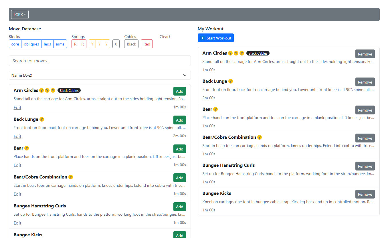
The prototypes gave users something tangible, which led to vital feedback I applied to future revisions of this app.
"Welcome to the longest-running deathmatch in the known universe. Fighters from every corner of every dimension engage one another in combat on these accursed battlegrounds. Mörkal Komborg takes place in the Mörkvärld, a floating castle-island surrounded by the shards of countless realms that it has absorbed."